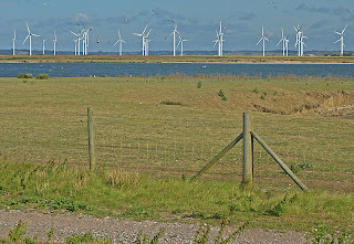
No visit there would be complete without an image of the power station, which dominates the landscape. I took this in howling wind from the top of the old lighthouse and was very grateful for the rusty barrier, my sense of vertigo having made itself felt despite my enthusiasm for the photographic potential.
This image started as a vertical, but the bottom half was mostly taken up by the unattractive railings which didn't really add to the image - but the hint of it was useful to provide the context. However, the vertical format meant I had to make widthways choices - and I wanted to show the pylons snaking out taking the electricity into the wide world, which meant the left hand side of the plant is chopped off, not particularly successfully.

The horizontal format however enabled the whole of the plant to be shown in this wide angle view, showing its size and context. The subject means that neither are attractive images although as a point of interest, really saturating the green could bring a very "nuclear" appearance to the whole place - for the purposes of this exercise I restrained myself, however.
 This bitumen-covered hut does I think really suit the vertical format because you get a better sense of all the ropes spewing out of it with the additional foreground possible.
But the horizontal version gets the nearby shed in as well, giving a greater sense of perspective even though I did manage to chop the top of the roof off making the image rather cramped.
 In retrospect I should have taken the vertical shot of this beached boat with its back end next to the frame so that it gave an impression of the distance it was looking out at. Again, I quite like the foreground this positioning gives however, and the way in which it's in the midst of the shingle rather than near the sea.
 In the horizontal frame and with a wide angle the compression of the clouds give a sense of the space so characteristic of Dungeness and the position of the boat within the frame is better. I do think horizontal works better here.
I was particularly pleased with the bright colours of the plastic boxes here, the ladder in the foreground giving a different sort of interest, as well as the blue boat on the horizon line. In the vertical frame the ladder takes on more prominence which I like, although at the expense of some of the additional clutter. In all, a simpler shot and overall I think I prefer this one.
 There's less of a sense of visual direction with the horizontal shot, there are almost too many things going on and to look at. Maybe if I had crouched down and gone for the ladder closer up it would have been more successful.
The lighthouse is an obvious contender for a vertical shot, but by standing some way back from it and placing it in the landscape (as well as some careful work with the golden mean plug-in and fairly severe cropping) it works well, and provides a great sense of location and sense of space.
 Vertical on the other hand seems a little predictable... if a standard image of a lighthouse was required then fine, but the great thing about Dungeness is its openness.
The boardwalk provides two very similar shots and I'm not sure which works best, perhaps because it's so simple and I've cropped them both in a similar way. Both position the viewer right in the middle of it with a sense of being able to walk along it for some distance. Perhaps the vertical version gives a greater sense of going up hill and length?


I also took this pair of images just outside of High Wycombe on an evening walk, and particularly like the light and colours. For me, the vertical framing is the least intuitive here and doesn't work with the lines of the hills, and the smidgen of sky is hardly worth bothering with especially as the brightness doesn't enhance it, perhaps cropping it out is the answer, but even with that I think the horizontal works better, particularly following the diagonal line across the frame and giving a sense of direction.

 Overall, this exercise has shown me that I should take both horizontal and vertical frames of most images and then have the luxury of choosing which works best later. It will also make me think more closely about where I stand and the position of the subject of the subject within the frame, depending on what I want to emphasise.
 Vertical on the other hand seems a little predictable... if a standard image of a lighthouse was required then fine, but the great thing about Dungeness is its openness.
The boardwalk provides two very similar shots and I'm not sure which works best, perhaps because it's so simple and I've cropped them both in a similar way. Both position the viewer right in the middle of it with a sense of being able to walk along it for some distance. Perhaps the vertical version gives a greater sense of going up hill and length?


I also took this pair of images just outside of High Wycombe on an evening walk, and particularly like the light and colours. For me, the vertical framing is the least intuitive here and doesn't work with the lines of the hills, and the smidgen of sky is hardly worth bothering with especially as the brightness doesn't enhance it, perhaps cropping it out is the answer, but even with that I think the horizontal works better, particularly following the diagonal line across the frame and giving a sense of direction.

 Overall, this exercise has shown me that I should take both horizontal and vertical frames of most images and then have the luxury of choosing which works best later. It will also make me think more closely about where I stand and the position of the subject of the subject within the frame, depending on what I want to emphasise.


 I couldn't get any closer because I'd have got run over by the speeding traffic but this makes the point amazingly - what a massive amount of vertical distortion! Top tip is I guess stand as far back as possible to take pictures of this sort. Although, having said that, there is that lovely Remove Vertical Distortion tool in Elements which can help sort some of this stuff out, except that you do lose the edges - not always desirable.


