Wednesday 30 December 2009

Project 39 - using faster film and higher sensitivity

This project is about using increasing ISO levels to capture images that would not be possible using medium speed film (is it still called film in the land of digital?). While this section is specifically around natural light I have taken the liberty of assuming this means no flash - there are therefore several images here using available light sources, both natural and artificial.

Brighton pier - helter skelter view
Starting somewhat extremely with an ISO of 3200, I wanted to see the results of using the fastest film in my camera, and I have to admit to being pretty pleased with the result. While there is no doubt that it is pretty grainy the lights of the helter skelter in the distance are reasonably sharp and the people in the foreground have also been captured reasonably clearly. I could see using this high level of film to create a specific effect, particularly perhaps a rainy black and white type image, although it would be no use where pinsharpness is essential.
The image created using an ISO of 400 is less clear due to camera shake and the longer exposure time - but is also less grainy.
ISO 3200 1/60 sec f5.6
ISO 400 1/13 sec f6.3
Funfair - movement
Composition aside I have struggled to distinguish significantly between these two images taken with ISO 200 and 800 respectively: they are both well lit, the colour is strong in both and the sense of movement has also been captured. The smaller aperture and shorter exposure time in the ISO 800 version however does provide greater scope for increasing depth of field and ensuring no issues with camera shake.
ISO 200 1/13 sec f6.3
ISO 800 1/25 sec f5.6
Christmas tree and moon
I have included all three images taken of this subject as the differences between ISO levels can easily be seen. The most successful image is, I think, that taken with ISO 800: a clear moon and individual lights (even when zoomed in) and limited graininess. The ISO 100 version shows clear signs of camera shake, unsurprisingly at 0.3 sec - although of course a tripod could have alleviated that. The ISO 400 version is somewhere in between - while not bad, the lights don't have the clarity of the ISO 800 version.
ISO 800 1/20 sec f5.6
ISO 400 1/10 sec f5.6

ISO 100 0.3 sec f5.6
Wooden detail
I took a series of six images at this location - outside, but in shade. Three were at an ISO of 400, and the others at 100. Without exception, all ISO 100 images suffered from camera shake, whereas the ISO 400 images are clear and without real sign of graininess. Shooting in fine resolution I suspect helps this - even when zooming in on the images they tend to be much larger than I am ever going to use them, which minimises the speckled effect.
ISO 400 1/30 sec f4.5
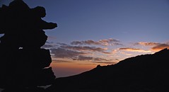
Into the sunset
Although the sun has disappeared other lights are emerging. These two images are taken at ISO 400 and 800 respectively, and I think the key difference between them is brought about by the extended shutter speed in the ISO 400 version, which has enabled more light to be cast on the railing.
ISO 400 1/8 sec f5.6

ISO 800 1/13 sec f5.6
Spiral
While I took this image indoors it was entirely illuminated by the natural light of massive windows and benefiting from an open view of the sea. I was aiming to maximise graininess to soften the smooth glass and metal edges of the central sculpure and spiral staircase, and so used an ISO of 1600. I like the effect overall - the subject too is clear to see even at this high level of sensitivity.

ISO 1600 1/125 sec f3.5

Saturday 12 December 2009

Assignment 2

For the assignment submitted I included a sketch showing the colour relationships as well as some short notes explaining how they worked in each of the images.

Complementary colours

1 - harmony (contrasting)

1 - Harmony (contrasting)-3

1 - Harmony (contrasting)-2

1 - Harmony (contrasting)-1

Contrasting colours

3 - Contrast-2


3 - contrast-1

3 - contrast-3

3 - contrast

Harmony - warm

2 - Harmony (warm)-2

2 - Harmony (warm)-1

Harmony - cool

2 - Harmony (warm)

2 - Harmony (cool)

Accents

4 - Accents

4 - Accents-3

4 - Accents-2

4 - accent

4 - Accents-1

Project 36 - warm and cool colours

Warm and cool colours - a bit of both!
The low sun across the sea gave the beach huts a bit of a glow although the pale green of the huts and the blue sky are cool colours. The red of the huts and splashes of colour warm it up however. Cool colours - I particularly like how the pink also seems cool when placed in conjunction with the blue and the green.
Warm colours - an early attempt at "warm" for the assignment, but later rejected - although I like the effect of the colours together, the shininess of the wrappers are a distraction. I'm looking forward to learning more about light, and how to avoid this sort of effect!

Project 35 - colour relationships

I've been preparing for Assignment 2 for so long that this is a great opportunity to use some of those images that didn't make the final selection.
Colours in proportion
Red: green in 1:1 ratio Orange and blue in a 1:2 ratio
Yellow and violet in a 3:1 ratio

Other images showing complementary colour relationships:


Project 34 - black and white and grey as colours

Black
I took five pictures in total for the black image, and concentrated on the colour rather than the overall composition - clearly! The median values on the histogram range between 48 and 2, but for the darkest I had to resort to Photoshop to get it that low - the camera didn't take it further than down to 14, perhaps due to the lighter lettering in the image. The darkest black is so much more satisfying than the lighter, which looks very washed out in comparison.


White
This was a really exciting project - although at first glance it might not seem so! Seeing the variation between these greys and whites was incredible. My subject was some sort of white plastic that formed part of a supermarket's branding, and should therefore have been pretty even. The levels vary between 130 for the darkest grey (bottom) and I again edited the lightest white to get it to 255 as the camera didn't make it above 206. There's a distinct pink tinge on the right hand side of two of the images (the direction the sun was coming from).


Project 33 - secondary colours

The secondary colours are more tricky to find, particularly given that I go to work in the dark and come home in the dark at this time of year, and the number of dark and rainy days we have had that makes naturally lit photography that much more difficult. I have focused therefore on looking for these colours although in not the most inspired context... but I will be continuing to build my photo library of colours over the coming weeks and months.
The location of the light and its impact on these comparatively flat colours also makes a massive difference to how they appear, and perhaps that is partly because the light isn't being used creatively in a total image - and the sun is also very low at this time of year making things a little trickier.

Violet
This painted beach hut door was the setting my camera chose and comes closest to the colour circle, and the two below respectively over and under exposed by a stop. The range this creates is quite astonishing.


Green
Another beach hut door and again the camera setting exposure comes closest to that in the colour circle. When the spring comes I will be able to find a massive range of green occurring naturally.


Orange
The satsumas too provide a representation of orange close to the colour circle when using the camera's choice of exposure.