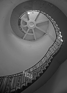
This is inside the lighthouse at Dungeness...
 And so is this ... but it's part of the light-making mechanism (despite working with engineers that doesn't make me one!)
 And so is this ... but it's part of the light-making mechanism (despite working with engineers that doesn't make me one!)
 Water bottle. Also important, particularly at altitude. Makes a sort of triangle.
 Citronella oil to keep the mosquitos at bay at lower altitudes and help prevent malaria. Sets up an implied line between the two bottles and therefore a diagonal sense of direction.
 Woolly socks... these do rather spoil the line.
 But the addition of the Tanzania guidebook evens things out a little and starts an anti-clockwise viewpoint, particularly with the hat and bottle - the strength of these colours having quite an impact.
 But the introduction of the dioralyte (in case of tummy bugs) just off to the side introduces an unresolved tension between the items, partly I think due to its comparatively small size. It is no longer a cohesive group.
 By again reorganising and keeping similarly coloured items together, and using the tassles on the hat to link between the reds and the blues this makes a more satisfying image. The size and shape of the emergency trail mix reflects the book as well, helping provide top to bottom cohesion as well as side to side.